As a proof of concept (POC) of mortgage analytics, I did an exercise to predict borrowers turning out bad (not paying their term timely). I selected as much variables as I can and extracted from the operational database. Due to security reasons, I am not going to explain or show the data and the variables.
For demonstration purpose, I took 284 loans which are in arrear (did not pay their term) for the last 12 months (Yes) and 1049 loans which are not in arrear for the last 12 months (No). This is just a random set and as can be seen easily, the data is imbalanced as there are fewer cases where loans stay in arrear for 12 months or more.
To collect, cleanse and aggregate the data, I used T-sql since the data is stored in MSSQL server.
To analyze and visualize the data, I used R.
First, the data has to be imported as follows (the directory should be replaced with the correct path according to the user)
| > datap<-read.csv(“directory/filename”) %directory and filename should be replaced with the right values depending on the user. |
Once the data is imported, different operations have to be performed to understand the data. In my case, since I used t-sql to extract the data, a lot of data cleaning is already performed.
| str(datap) %provides the metadata info of the variables
summary(datap) %provides the summary (min, max, median,1st,and 3rd quartile for numeric) attributes and frequency distribution for categorical variables. Note:- if there is a big difference between mean and median, there may be an outlier. %plotting whole dataset to have an overview of the data is difficult due to high number of variables So subsets of data is used before plotting eg. datasub1<-datap[,c(1:8,15)] %makes a subset of columns 1 to 8, and column 15 which is the target variable plot(datasub1) |
In addition, to understand the individual variables, a plot of each variable is done as follows:-
| plot(datap$loan_income) %to use the name of the variables directly, the dataset can be attached as follows.
Attach(datap) |

Boxplot is much nicer in detecting outliers as can be seen as follows.
| boxplot(datap$loan_income) |

More understanding of data can also be done by different graphical forms. For example, to see the data distribution per province, a 3D pie chart can be used as follows.
| pie3D(table(datap$province)) |

Another important visualization could be to plot pairs of variables (one in x-axis, one on y-axis, and another as coloring etc). For example, the following is used to see the distribution of income distributed across provinces colored based on the target variable (i.e whether the loan is in arrear for the last 12 months or not).
| ggplot(data = datap, aes(x= loan_income, y = province, color = Arrear12Month))+geom_point()
%ggplot2 package should be installed by using install.packages(“ggplot2”) |

From this, Friesland tends to be clean and Flevoland tends to be sensitive (also the income distribution can be seen). Similar graphs can be generated for other combination of variables.
Facet grids are also helpful tools to visualize data per category. Especially, it is helpful to categorize based on the target variable.
| commp<-ggplot(data = datap, aes(x=commercial_prod_servicer))
> commp+geom_bar() > commp<-commp+geom_bar() > commp+facet_grid(.~Arrear12Month) |

This way, it is possible to see the influence of each variable per category.
Density plot also helps to see distributions per category as shown below.
| ggplot(data = datap, aes(x= LTI, fill = Arrear12Month))+geom_density() |

Scatter plot also gives a quick overview of relationships among variables about the data dataset. Running scatterplot on the subset of the data identified earlier as follows gives the following.
| scatterplotMatrix(datasub1) %the car package has to be installed |
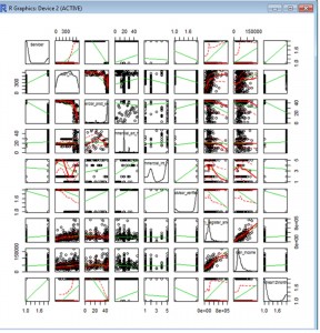
The scatterplot shows clear relationships on some of the variables.
Another important graphical view is the corrgram depiction which shows the correlation of each variable in color matrix. Dark blue shows strong positive relationship and Dark red shows strong negative relationship. The corrgram in this dataset is given below.
| library(corrgram)
corrgram(datap) %the color coding represents (red = neg correlation, blue = positive correlation) |

After understanding the data, variables that are considered to be useful have to be selected for modelling. One can consider more advanced feature selection for a better set of variables for efficient modelling. In this case, only correlation value is used to select which features to use for modelling. So, using the selected features, the modelling is developed as follows.
| %First the dataset has to be split in the form of training and test dataset (60% vs 40%)
> set.seed(2000) %this is helpful to reproduce the random numbers again. > d = sort(sample(nrow(datap),nrow(datap)*.6)) %sample 60% for training > train<-datap[d, ] %assign the 60% to training > test<-datap[-d,] %assign the remaining 40% for testing %For developing the model, rpart is used as follows. > modelsplit<-rpart(formula=Arrear12Month~Servicer+commercial_prod_servicer+commercial_ext_hds+commercial_int_hds+advisor_verified+notary_register_amount+loan_income +loan_foreclosure_value + loan_marketvalue + nhg_Ind +number_of_parts + nationality_hds + Age + gender+ marital_state+employment_hds+gross_income+province +nr_clients + LTI + LTV +redemption_hds + application_hds , data = train, method =”class”,control=rpart.control(minsplit=10, cp=0)) > summary(modelsplit) %dispaly the result of the model which is stored in the modelsplit variable. > prp(modelsplit, extra=1, uniform=F, branch=1, yesno=F, border.col=0, xsep=”/”) %depicts graphically the result of the rpart model %libraries –rpart and rpart.plot are necessary for prp function to work
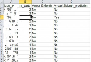
%Now, we can generate the prediction for the test data and compare the test prediction result versus the actual label of the target variable > Prediction <- predict(modelsplit, test, type = “class”) %In the following code, only the keys of the records, the target variable value, and the predicted value are chosen to make the result readable. > submit <- data.frame(loan_nr = test$loan_nr, nr_parts = test$number_of_parts , Arrear12Month = test$Arrear12Month,Arrear12Month_prediction = Prediction) > write.csv(submit, file = “directory”, row.names = FALSE) %store the result in a certain directory |

Now, we can check how the model performed. Some of the results are given below. In terms of accuracy, it provides 97% accuracy. Obviously, this seems to be an over fit. That is due to the amount of the dataset used (it is a very small sample to rely on).
In R, it is also possible to see the distribution of the data geographically. In this exercise, I took a file that contains postal codes of the Netherlands together with the corresponding latitude and longitude and I geocoded the above dataset with the help of this file (zipcode is used to link the two files).
Then I used the ggmap package as follows:-
| > install.packages(“ggmap”) %if the package is not installed yet
> library(ggmap) > datap2<-read.csv(“directory/filename.csv”) %Directory and filename should be replaced with the right values depending on the user > qmplot(lon, lat, data = datap2, colour = Arrear12Month, darken = 0.5, size =I(3.5), alpha=I(.6), legend = ‘topleft’) %depicts the dataset on the map. |
